
Kitchen colour ideas for Irish homes, and how to choose one that lasts
The kitchen colours that work best in Irish homes are the ones that suit soft, often grey light: warm whites, muted greens, warm greys and deep blues, with the darkest colours kept low down or on an island. The right colour for your kitchen depends on the light in the room, its size and the worktop beside it, far more than on any photo. This guide from The Home Upgrade Co. goes through kitchen colours and ideas colour by colour, what worktops, floors, handles and walls go with each, and how to see your choice before anything is made. We design and fit made to measure kitchens across Dublin, Meath, Kildare and Wicklow.
Want to see a colour in your own kitchen before you decide? Free measure, free 3D design, one itemised quote.
Message us on WhatsApp Or call 089 222 3395
On a computer?Scan this with your phone camera to open WhatsApp there.
Start with the light in your kitchen, not the colour chart
Irish light is soft and often grey, and it changes how every kitchen colour looks. A shade that looks warm on a bright sample card can look flat or cold on a wet winter afternoon, so the first thing to know is which way your kitchen faces and how much daylight actually reaches the units.
North facing kitchens get cooler, indirect light all day. They take the warmth out of cool greys and brilliant whites, so colours with a little yellow, red or green in them hold up better there. South and west facing rooms get warmer light for part of the day, and they can carry cooler colours and deeper shades more easily. A long galley lit from one small window at the end is closer to a north facing room than its orientation suggests.
Lighting matters as much as daylight, because most kitchens are used after dark for half the year. Warm white under cabinet lighting changes the feel of the same colour entirely, and cool LED lighting can make a white or grey kitchen feel like a showroom rather than a room. Before you commit, look at a real door sample in the kitchen itself, in the morning, in the evening and with the lights on.
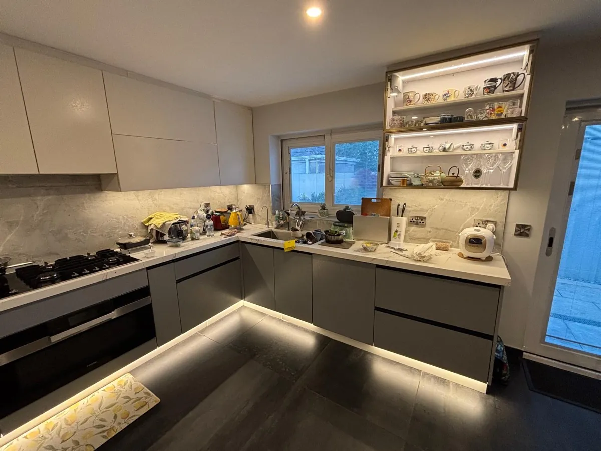
What colour kitchen is timeless?
Quiet, slightly warm colours last longest: off white, stone, muted green and soft grey, paired with a simple door and a natural looking worktop.
A kitchen rarely dates because of its colour alone. What dates it is a colour that was chosen because it was everywhere that year, on a door with a lot of detail, beside a worktop that was fashionable at the same time. Keep the door simple and the colour quiet, and the kitchen has very little to date.
The door style helps. A framed shaker door has been made the same way for well over a century and sits happily in a terrace or a new build, which is why our shaker kitchens page suggests keeping the colour quiet and spending on the worktop and the handles. Those two, and the wall colour, are also far cheaper to change later than the kitchen itself. If you want a stronger colour, putting it on the island rather than the whole run gives the room character without committing everything to it.
Is a white kitchen still a good choice?
Yes, but choose a soft or warm white. Brilliant white can look cold and slightly blue in grey Irish light, especially in north facing rooms.
A white kitchen is still the easiest colour to live with. It suits small rooms, it goes with almost any worktop and floor, and it will not fight with the rest of the house. The risk is not that it dates, it is that it can feel clinical.
Off whites with a little cream, stone or grey in them look calmer in Irish light than a pure white. Warmth from elsewhere does the rest: a timber worktop or open shelf, an oak floor, or brass handles. An all white kitchen with a white worktop, white walls and cool lighting is the version that tends to feel like a showroom.
Is a grey kitchen dated now?
Not if the grey is warm. Cool blue greys look flat in north facing rooms; greys with some beige or green in them hold up.
Grey has been one of the most common kitchen colours for years, which is exactly why a very cool, very flat grey can now read as a particular period. The fix is not to avoid grey but to choose it carefully. Warmer greys, greys that lean towards stone or putty, and greys with a hint of green all look softer through a wet winter.
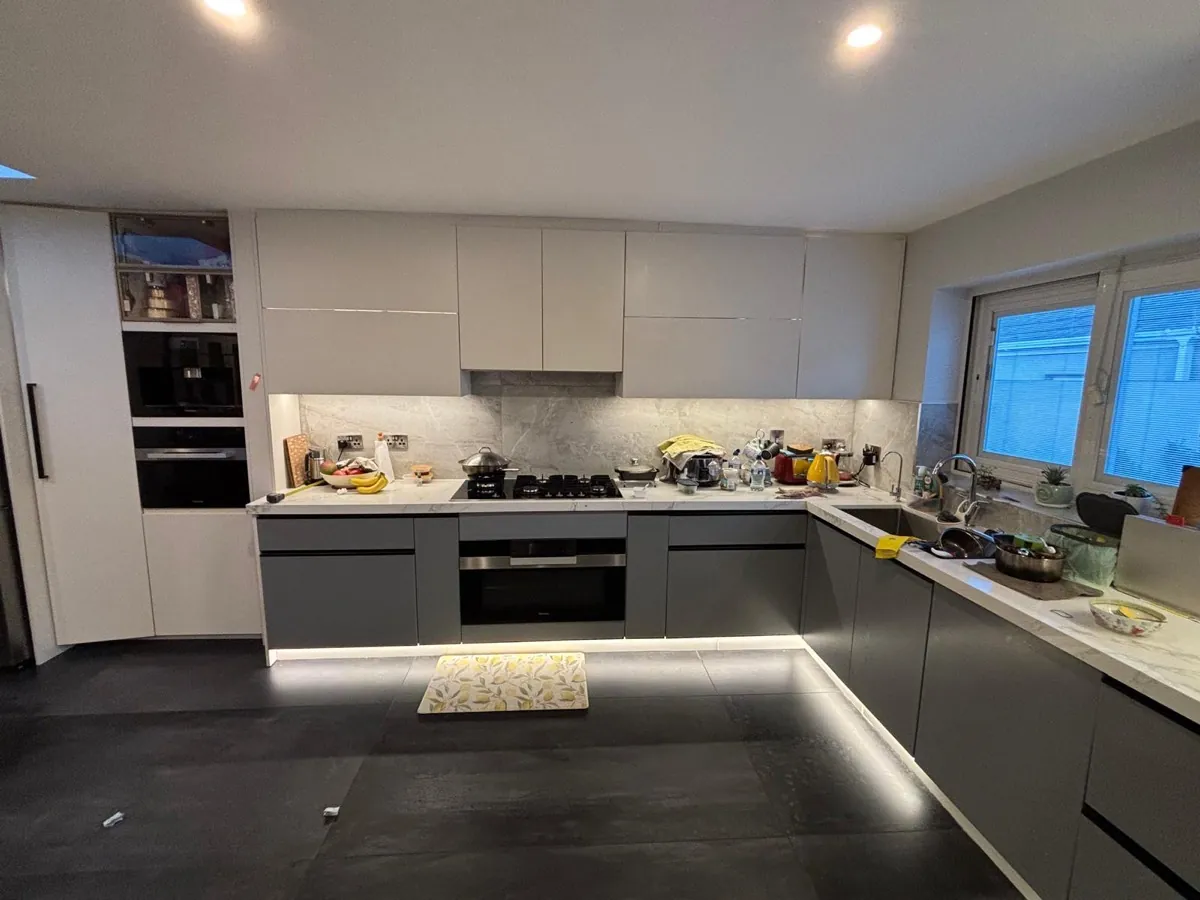
Grey also depends heavily on what surrounds it. A grey handleless kitchen with a white marble effect worktop and warm lighting feels very different from the same doors beside grey floor tiles and cool LEDs. If the room is cool already, bring warmth in with the worktop, the floor or a timber element.
Is a green kitchen a good idea?
Yes. Muted greens suit soft Irish light and most house styles, and they pair easily with timber, white or pale stone worktops and brass handles.
Green is one of the colours that suits Irish houses best, because a green with a little grey in it sits comfortably with the garden outside and the soft light inside. Sage and other muted greens work on a shaker or in frame door in an older house, and a deeper green can look striking on flat doors in a modern room.
Green is also more forgiving in a small kitchen than people expect. A mid green kitchen with walls to match can feel more spacious than a white kitchen with a dark worktop and contrasting handles, because the eye has fewer hard edges to stop at. If you are unsure, try green on the island or the base units first and keep the wall units lighter.
Do navy and blue kitchens work in Irish homes?
Yes, in a room with decent light or on an island. Deep blue looks rich beside timber and pale worktops but gloomy in dark rooms.
Navy and deep blue give a kitchen real presence, and they suit both framed and flat doors. They need two things to look their best: enough light, and something warm or bright beside them. A pale worktop, a timber island or brass handles all lift a blue kitchen. Without them, deep blue in a north facing room can read as close to black on a grey day.
Softer blues are the easier choice for a whole run of units, especially in a smaller or darker room. A common and reliable approach is a lighter colour on the main run and navy on the island, which puts the strongest colour where the light and the eye both land.
Is a black kitchen a good idea in a small room?
It can be. Black on base units or an island works well, but black wall units in a small, dark room close it in.
A black kitchen looks dramatic in a bright, open plan room, especially in a matt finish beside timber or a pale worktop. In a small kitchen the question is where the black goes. Dark colour low down grounds the room, while dark wall units at eye level make the walls feel closer.
What makes a small kitchen feel bigger is continuity rather than simply brightness. So a small black kitchen works best with fewer edges: a handleless run with no repeated line of hardware, a splashback close in tone to the units so they blend rather than contrast, lighter wall units or open space above, and good lighting under any wall units. Two practical things to know: matt finishes suit dark colours best, and dark surfaces show dust and fingerprints more readily than light ones, so ask about fingerprint resistant finishes.
What is a two tone kitchen, and how do you get it right?
Two colours in one kitchen, usually darker on the base units or island and lighter above. Keep them related and let one lead.
A two tone kitchen is often the answer when you love a strong colour but worry about living with it everywhere. The usual splits are dark base units with lighter wall units, a coloured island with a quieter run around it, or timber alongside a painted colour.
A few rules keep it looking deliberate. Put the darker colour low, because dark wall units over light base units look top heavy. Let one colour clearly lead, rather than two strong colours competing. Pick colours that share an undertone, such as a warm off white with a muted green, rather than a cool white with a warm navy. And keep the worktop and handles consistent across both, so the kitchen still reads as one design.
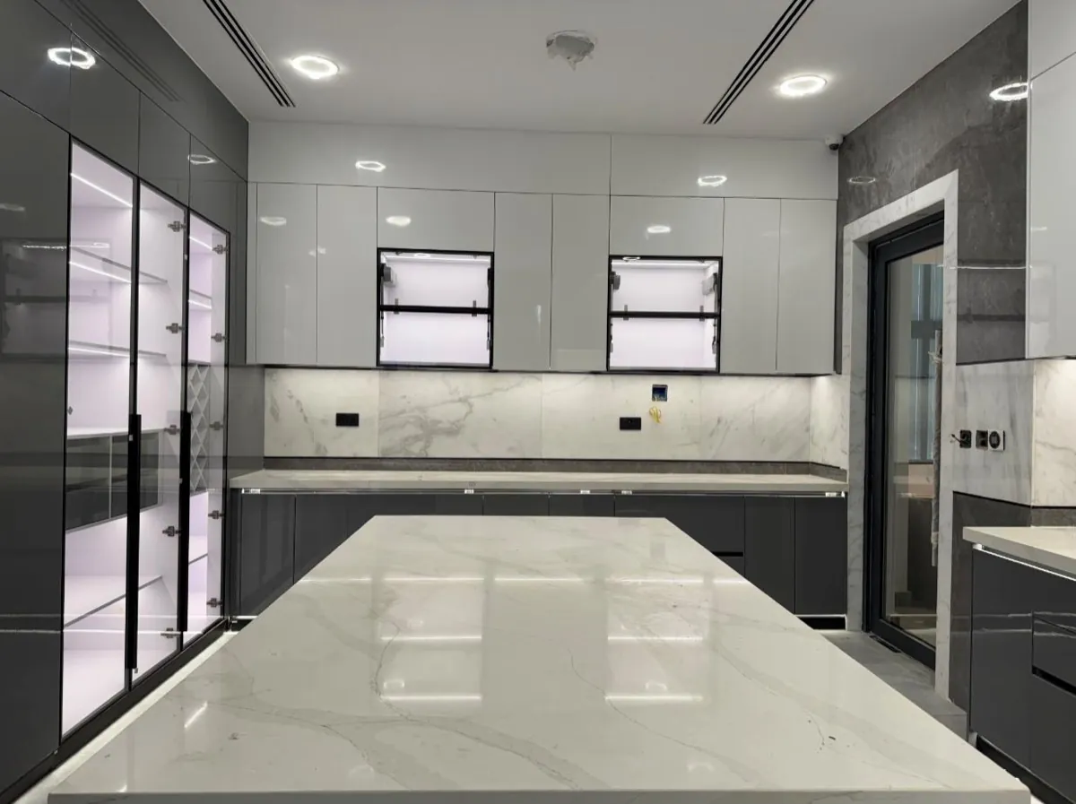
What colour worktop goes with a green, navy or grey kitchen?
A pale worktop with some warmth suits most coloured units: white or cream quartz, a soft marble effect, or warm timber. Avoid exact matches.
The worktop is where a coloured kitchen either comes together or goes flat. A light worktop gives a strong colour something to sit against, and a worktop with some visible movement adds texture that a single flat colour cannot. Timber is the other reliable partner for painted units, because it brings warmth that suits green, navy and grey alike. The choice of material matters as much as the shade, and we compare the two most common options in quartz vs laminate worktops.
These pairings are starting points rather than rules. Your own light, floor and walls will change them, which is why we bring samples to the design visit.
| Unit colour | Worktops that suit | Handles | Walls and floors |
|---|---|---|---|
| White or off white | Almost anything: timber for warmth, a marble effect, or a darker quartz or stone for contrast | Brass, black or brushed steel, or handleless | Warm white walls; a timber or mid tone floor stops it feeling clinical |
| Grey | White or cream quartz, a marble effect with soft grey veining, or oak | Black or brushed steel, or handleless | Warm neutral walls; avoid cool grey units over cool grey floor tiles |
| Green | White or cream quartz, pale stone, or warm timber | Brass or black | Off white walls or a paler tone of the same green; oak or other warm floors |
| Navy or deep blue | White quartz, a pale marble effect, or timber | Brass or brushed steel | White or stone coloured walls; lighter timber floors |
| Black | Light timber, white or pale stone, or a marble effect | Brass, or handleless for a seamless run | Light walls in a small room; warm floors and good lighting |
| Two tone | One worktop across both colours, chosen to suit the lighter one | One handle finish throughout | Walls close to the lighter colour, so the darker one stands out |
Floors are the part people forget to bring into the decision. If you are keeping an existing floor, bring a photo or a spare tile to the design visit, because a warm oak floor and a cool grey tile push the same unit colour in opposite directions.
Should kitchen walls match the units?
In a small kitchen, keep walls close to the unit colour so the room reads as one. In a larger room, gentle contrast adds definition.
When units, walls and worktop sit close together in tone, the eye travels across the room instead of counting boundaries, and that is what makes a room feel bigger. Matching wall units to the wall colour is one of the simplest ways to make a run of units recede. Our small kitchen ideas guide goes into the other ways to make a tight room feel larger.
In a larger or open plan room you have more freedom. A soft contrast between walls and units gives the kitchen shape, and a stronger contrast on one feature, usually the island, gives it a focal point. In open plan spaces, think about the colours in the living area too, since the kitchen will be seen alongside them every day.
Which finish suits a coloured kitchen: matt, gloss, painted or timber?
Matt suits most colours and wears best. Gloss bounces light in a dark room but shows fingerprints, and timber warms up painted units.
We make kitchens in painted, matt, gloss and timber effect finishes, and each one changes how a colour looks. Matt laminates and painted matt finishes wear best in a family kitchen, and they give deep colours like green, navy and black a soft, velvety look. Fingerprint resistant matt finishes exist, and they are worth asking about specifically if you have children.
Gloss reflects light, which is genuinely useful in a dark room, but it also reflects every fingerprint and scratch, and on a handleless kitchen that shows along the grip line where hands go. Natural timber and timber effect doors are a different, warmer look, and they work well as the second colour in a two tone kitchen. The finish you choose is also one of the things that moves a kitchen quote, since painted, matt, gloss and timber effect finishes sit at different points on it, and every choice is itemised.
What are the kitchen colour trends right now?
Warmer, deeper colours, natural wood tones and two tone schemes are widely seen. Trends move, so choose a colour that suits your house and light.
The requests we hear most at the moment are handleless doors and warm wood tones, and magazines and showrooms lean towards greens, deeper blues and warmer neutrals over the cool greys of recent years. That is a general direction, not a rule, and trend lists change from one year to the next.
The honest answer is that the right colour comes from your house, not from this year's display. A shaker kitchen in a muted colour suits an older house for decades. A flat modern door in a deeper colour suits a new extension. If you like a trend colour, the lowest risk way to use it is on the island or the walls, which are the easiest parts to change.
See the colour in your own kitchen before you commit
Kitchen colours are easy to love in a photo and hard to picture in your own room. That is what the free design visit is for. Stephen calls out within 2 working days anywhere in Dublin, Meath, Kildare and Wicklow, measures the room and talks through how you use it, with samples you can hold up in your own light. Within a further 2 working days you get a 3D design of your actual kitchen and one complete itemised quote.
The 3D design shows how a colour works across the whole room: how much of it there is, where a two tone split falls, whether a dark island overwhelms the space. A screen cannot show exactly how a paint colour will look on a grey morning, so use the design for balance and proportion and the physical samples for the exact shade. Changing colours at this stage is free. Our kitchen design page explains how the visit and the 3D design work.
There is no cost and no obligation, and we never chase. If you go ahead, the kitchen is made to your measurements and fitted by our own team within 12 weeks of sign-off, with our 2-year warranty on wood products written on your quote.
Frequently asked questions
What colour kitchen is most timeless?
Soft, slightly warm colours such as off white, stone, muted green and warm grey last longest. Pair them with a simple door and a natural looking worktop, and change the look later through handles and walls.
Is a dark kitchen a good idea in a small room?
It can work if the dark colour goes on the base units or island and the room has good lighting. Dark wall units at eye level make a small, dim kitchen feel closer, so keep those lighter.
What colour worktop goes with a green kitchen?
White or cream quartz, pale stone and warm timber all suit green units. Brass or black handles finish the look, and it is worth checking samples against your own floor.
What colour kitchen suits a north facing room?
Warmer colours suit a north facing kitchen best, such as creamy whites, warm greys and muted greens. Cool blue greys and brilliant white tend to look flat and cold in its steady, cooler light.
See your kitchen colour drawn in your own room
Worth reading next: how the free 3D kitchen design works.
Message us on WhatsApp and tell us about the room and the colours you like. We will take it from there.
Message us on WhatsApp